The “Grocery Girl” Aesthetic: Why We’re All Wearing Tinned Fish This Summer
Let’s be honest: if you had told me five years ago that the hottest accessory of 2026 would be a shirt featuring a can of Portuguese sardines, I probably would have laughed. But here we are, deep in the tinned fish trend.
You’ve seen it on your FYP. You’ve seen the elaborate Seacuterie style boards (that’s charcuterie, but with tinned seafood) piled high with artisanal crackers. You’ve seen the “Girl Dinner” phenomenon. It’s officially called the Grocery Girl Aesthetic, and it’s not just about food. It’s about a vibe.
It’s that specific feeling of wandering through a European market, picking up a tin of spiced mackerel just because the packaging was too pretty to leave on the shelf. But here is the problem: trying to capture this “Euro Summer” vibe with cheap, mass-produced clothing ruins the whole point of the Grocery Girl Aesthetic.
If you’re going to wear the trend, you need to do it right. That means ditching the thin, scratchy promo tees and upgrading to what we call “wearable decor.” In this guide, we’re breaking down why the Vintage Sardine Tin Shirt is taking over, why choosing a premium Comfort Colors graphic tee matters just as much as the print, and how to choose between the two heavy hitters in our collection.
What is the Grocery Girl Aesthetic, Really?
At its core, the Grocery Girl Aesthetic is a rejection of sad beige minimalism. It’s maximalist, it’s colorful, and it’s a little bit ironic. It celebrates the mundane beauty of domestic life—specifically, the pantry.
We aren’t talking about a logo from a big-box supermarket. We are talking about Retro Conservas—vintage packaging from Portugal and Spain where typography and illustration were art forms. When you wear a tinned fish shirt, you aren’t just wearing a picture of a fish. You are signaling a specific type of cultural capital.
You’re saying, “I appreciate slow living. I appreciate good design. And I probably know which wine pairs best with spicy calamari.”
The “Wearable Decor” Concept: Why Most Prints Fail
When we analyzed the tinned fish trend, we noticed a massive gap. Most shirts you see on generic marketplaces are low-effort. They take a cheap clip-art vector of a fish, slap it on a shirt, and call it a day. It looks like a cartoon.
We took a different approach. We wanted our shirts to act as Wearable Decor.
We treat our designs like museum restorations. We use high-fidelity, distressed halftone textures that mimic the matte finish of an actual tin can found in a Lisbon grocery store in 1925. When you look at our prints, you see the “grain.” You see the history. It’s a kitchen poster you can wear.
The Canvas Matters: Why We Use a Comfort Colors Graphic Tee
You can have the most beautiful art in the world, but if you paint it on a napkin, it’s still trash. The same goes for t-shirts. The “Aesthetic Hedonist”—that’s you—cares about tactile quality. You refuse to buy thin, see-through fabrics that twist at the seams after one wash.
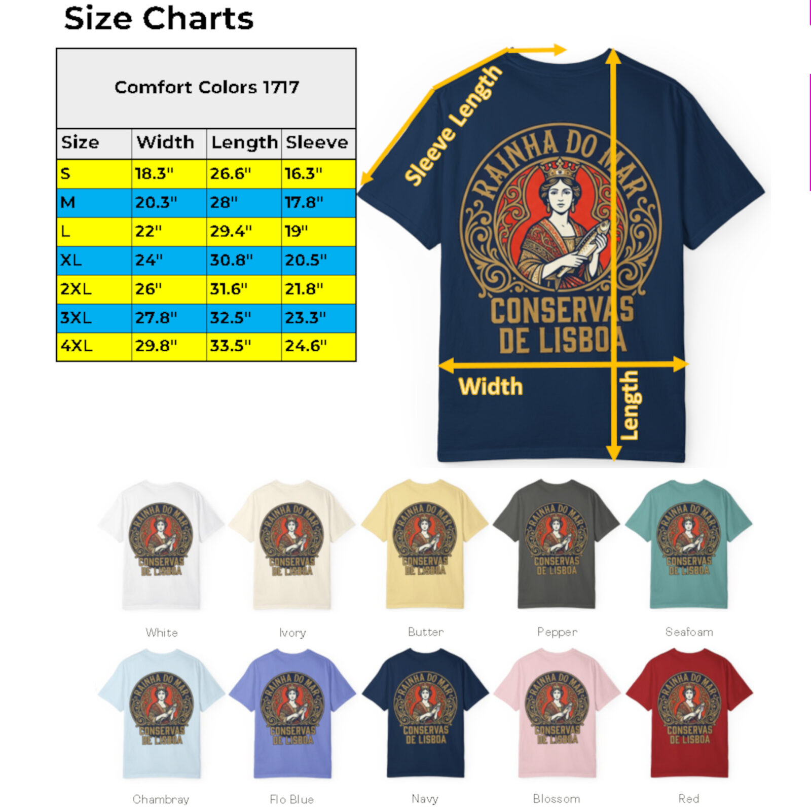
That’s why we exclusively use the Comfort Colors 1717 blank. It is the ultimate Comfort Colors graphic tee for this aesthetic. If you haven’t worn one, you need to. Here is why it’s the only choice:
- The Weight: It’s a heavyweight 6.1 oz fabric. It hangs with intention. It doesn’t cling; it drapes. It gives you that structured, boxy streetwear silhouette that looks expensive.
- The Wash: These shirts are garment-dyed. That means the fabric is dyed after the shirt is sewn. This results in zero shrinkage (it’s already done) and a soft, broken-in feel from day one.
- The Colors: We use “Yam” (a mustard yellow) and “Blue Jean” (a faded denim) because they look vintage immediately.
(Want to geek out on the specs? You can check the official Comfort Colors 1717 page here to see exactly why this fabric is legendary.)
The Showdown: Front Print vs. Back Print
Okay, so you’re sold on the quality and the vibe. Now you have a choice to make to perfect your Grocery Girl Aesthetic. We launched two distinct versions of the sardine tin tee because they serve two different moods.
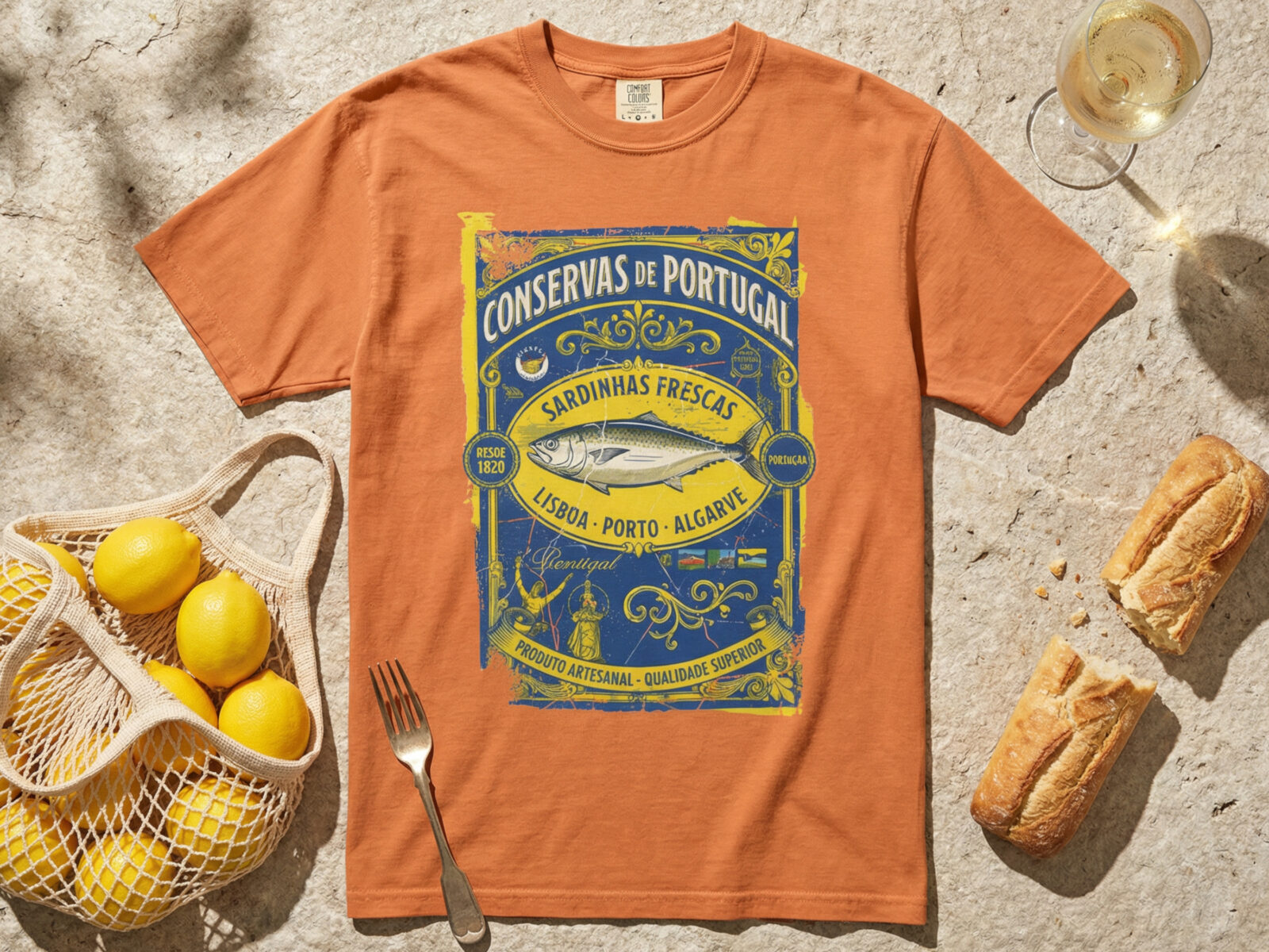
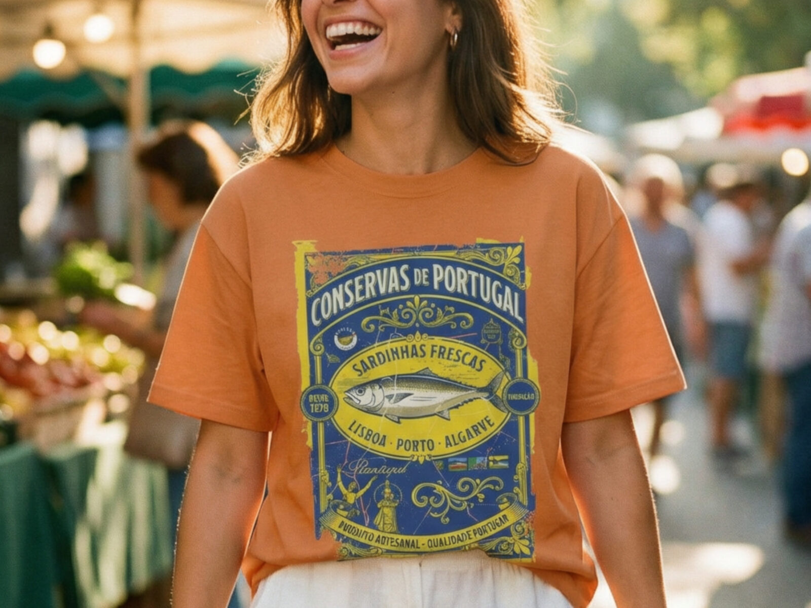
Option 1: The “Pop Art” Statement (Front Print)
This is for the bold. The Vintage Sardine Tin Shirt (Front Print Edition) places the artwork dead center on your chest.
- The Vibe: Streetwear, ironic, loud.
- Best For: Layering under an unbuttoned linen shirt or blazer. It’s a conversation starter immediately.
- The Tech: We use a Matte DTF print here that sits slightly on top of the fabric, making the colors pop aggressively against the heavyweight cotton.
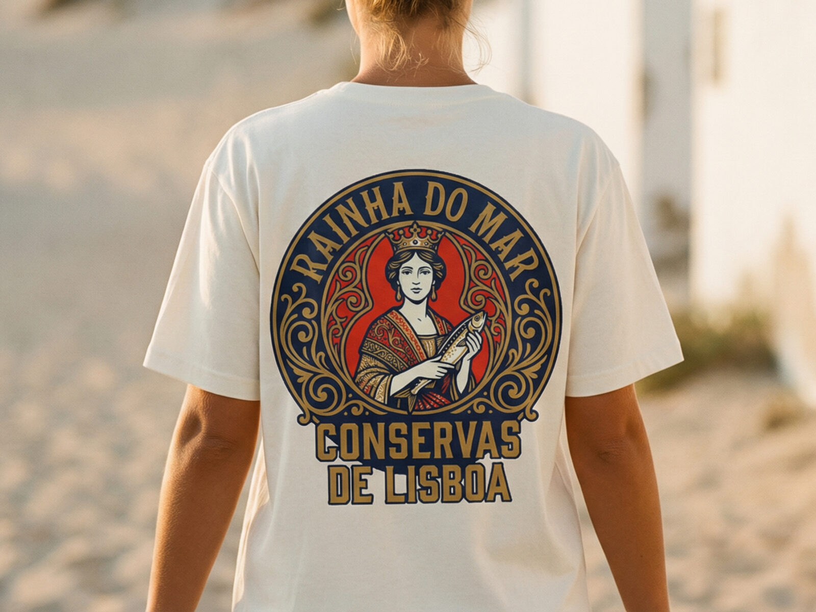
Option 2: The “Lisbon Souvenir” Memory (Back Print)
This is the best-seller that started it all. The Portuguese Sardine Tin Graphic Tee (Heritage Edition) features a small pocket logo on the front and a massive, intricate art nouveau poster on the back.
- The Vibe: “I just got back from Europe.” Chill, coastal, nostalgic.
- Best For: Walking away from people (seriously). It looks incredible tucked into denim shorts while you’re browsing a farmer’s market.
- The Tech: This uses a print style that blends more into the fabric fibers for that vintage “thrifted” look.
(By the way, if you want to see how other people are styling these, or check out our credibility, you can browse our Sardine Tin Collection on our Etsy store. We have 5-star reviews for a reason, but the best stock is always right here on the main site.)
How to Style Your Tinned Fish Tee
The key to mastering the Grocery Girl Aesthetic is balancing the “kitsch” of the shirt with “polish” elsewhere. Do not wear this with sweatpants. Here is the formula for peak Seacuterie style:
- The Brunch Look: Tuck the Yam colored tee into high-waisted white linen trousers. Add leather sandals and a woven tote bag.
- The City Look: Wear the Blue Jean tee oversized (size up one or two sizes) over bike shorts (“Princess Di” style) with chunky New Balance sneakers and gold hoop earrings.
- The Date Night: Yes, you can. Throw a structured blazer over the Front Print tee, pair with dark denim and loafers. It’s “Gastro-Chic.”
Final Thoughts: Don’t Buy the Knock-Off
Trends come and go, but quality stays. The tinned fish trend might be the viral moment right now, but appreciating beautiful art and heavyweight cotton is forever. Whether you choose the loud front-print pop art or the subtle back-print heritage vibe, you’re getting a piece of wearable decor that feels as good as it looks.
Ready to secure the catch of the day?

Vintage Sardine Tin Shirt – The “Pop Art” Front Print Edition
Wear the “Grocery Girl” aesthetic with this heavyweight front-print tee.
We’ve recreated the nostalgia of vintage Portuguese conservas using high-fidelity matte ink on an authentic Comfort Colors 1717 blank.
It’s not just a shirt; it’s wearable pop art for the modern foodie. Unisex, boxy fit, and built to last.

Rainha do Mar Portuguese Sardine Tin Tee – Premium Comfort Colors® Edition
Capture the authentic “Luso-Tropical” vibe with the Rainha do Mar Portuguese Sardine Tin Tee.
Printed on a premium Comfort Colors 1717 blank, this heavyweight Foodie Streetwear shirt features high-fidelity vector art—not a blurry scan.
Designed for the “Sardinecore” aesthete who values quality over fast fashion.
🔥 RELATED PRODUCTS
-
Sale!

Modern Hotel Booking: Lightweight WordPress Reservation Plugin
Price range: $ 89.00 through $ 749.00Add To Cart This product has multiple variants. The options may be chosen on the product page -
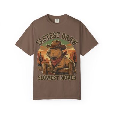
Capybara Shirt – Vintage Western Graphic Tee on Comfort Colors®
Price range: $ 28.99 through $ 39.99Add To Cart This product has multiple variants. The options may be chosen on the product page -
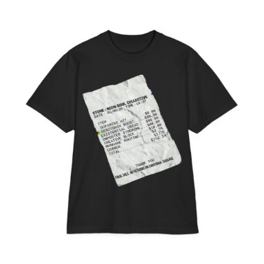
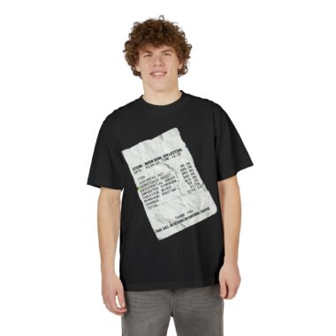
Existential Dread Receipt Tee — Heavyweight Oversized Streetwear
Price range: $ 39.99 through $ 48.99Add To Cart This product has multiple variants. The options may be chosen on the product page


